Stock image: Deposit Photos
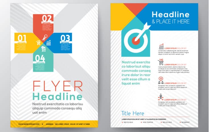
Designing a flyer that captures attention and communicates your message effectively is an art form. It’s not just about throwing together images and text; it’s about creating a visual narrative that speaks to your audience.
Your flyer is your ambassador, silently speaking on your behalf, and it needs to do so with both style and substance. Think of it as a handshake between you and your potential audience. The design should be inviting, the message clear, and the overall impact memorable.
In crafting this visual handshake, focus on what makes your message unique. Is it an event, a product launch, or a service announcement? Distill your message to its essence and let that guide your design.
A common mistake in DIY flyer design is trying to say too much. Remember, less is often more in design. A single, powerful image or a bold, concise statement has more impact than a cluttered collage of text and graphics.
Here are some tips to help you create a winning flyer.
Balancing Act: The Harmony of Text and Imagery
Striking the right balance between text and imagery is crucial. Imagine a flyer crowded with text; it’s overwhelming, like listening to someone who talks without pausing. Conversely, too many images with scant text can leave the viewer puzzled. The key is to achieve harmony. Use high-quality images that are directly related to your message. Pair them with concise, clear text that guides the viewer through the flyer. Remember, every element on your page should serve a purpose. If it doesn’t contribute to your message or design, it’s just visual noise.
When selecting images, consider their emotional impact and relevance to your message. A well-chosen image can speak volumes, often more than words can convey. In terms of text, focus on readability. Break information into digestible chunks. Headlines should be captivating and body text easy to follow. This balance of text and imagery will guide the viewer’s eye through your flyer, making the journey both informative and visually pleasing.
Color Your World: The Psychology of Color in Flyer Design
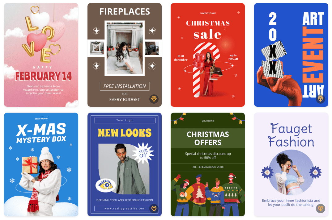
Colors are not just pretty; they’re powerful. They evoke emotions and can significantly impact how your flyer is perceived. For example, blue often conveys trust and dependability, making it a great choice for professional services. Red, meanwhile, can create a sense of urgency or excitement. It’s perfect for sales or events. When selecting colors for your flyer, consider the emotions you want to evoke and the actions you want to encourage. A tip: stick to a palette of 2-3 colors to maintain a cohesive look.
In practice, the right color palette can make or break your flyer’s effectiveness. For instance, a health and wellness workshop might benefit from calming greens and blues, suggesting tranquility and growth. On the other hand, a concert flyer could use bold, vibrant colors to convey energy and excitement. Additionally, ensure that there is sufficient contrast between your background and text colors for easy readability.

Image courtesy of Vista Create
The Magic of Fonts: More Than Just Words
Your choice of font is like selecting the right outfit for an occasion. It sets the tone. A whimsical font might be perfect for a kid’s birthday party flyer, but it would be out of place for a corporate event. Also, readability is key. Avoid overly decorative fonts for the main body of text. Keep it simple and legible. A good rule of thumb is to limit yourself to two fonts: one for the headline and another for the body.
The right font pairing can elevate your flyer from amateur to professional. For headlines, a font that’s bold and attention-grabbing works best. For body text, opt for something more understated and easy on the eyes. Avoid the temptation to use multiple fonts as it can make your flyer look disjointed and confusing. An experienced designer’s advice: test your fonts at various sizes to ensure they are legible both up close and from a distance.
Vista Create: Your Flyer Maker Companion
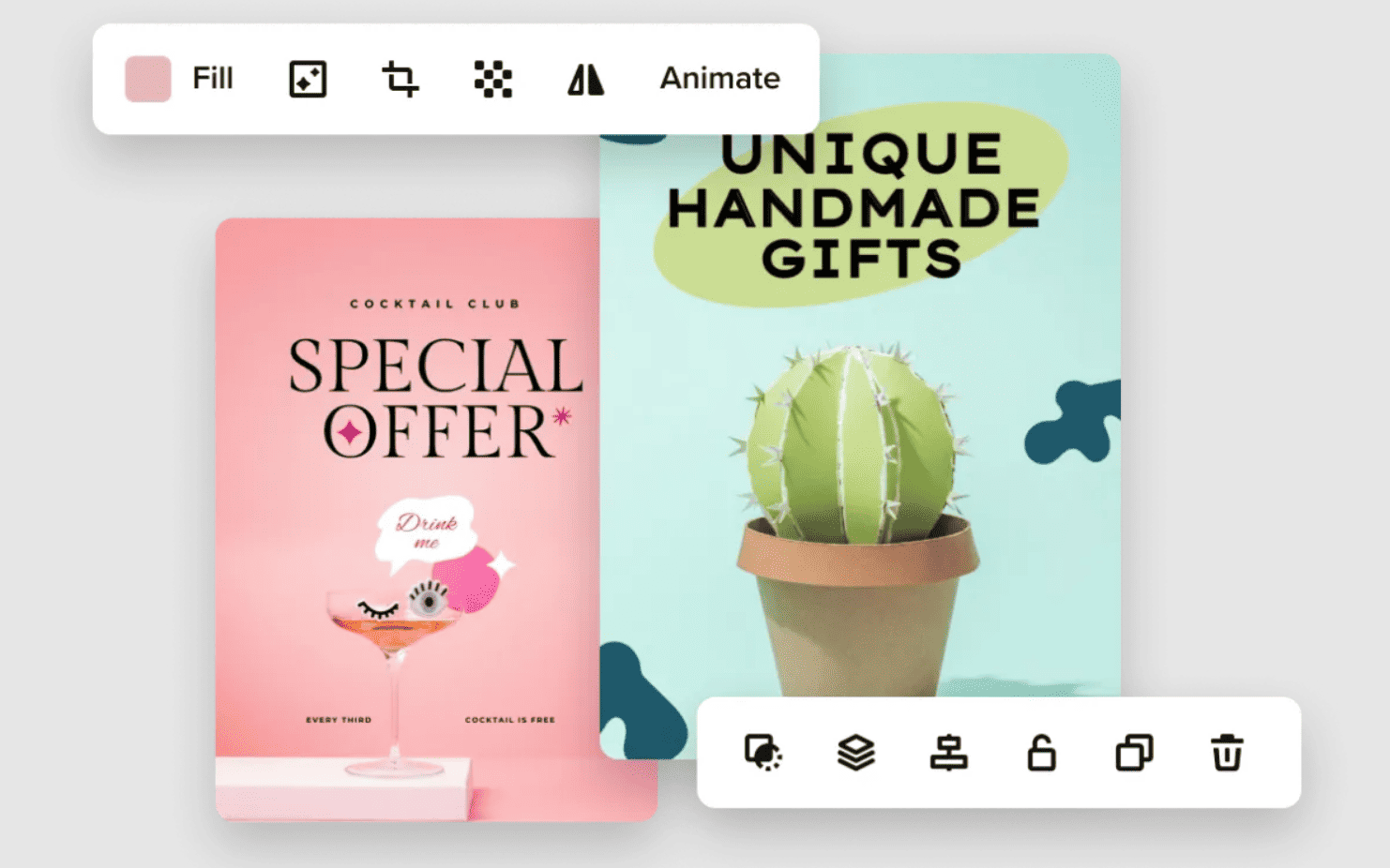
When it comes to bringing these elements together, the Vista Create tool can be your best friend. This flyer maker offers a plethora of templates and design elements, making the process seamless. With its intuitive interface, you can experiment with layouts, colors, and fonts to find the perfect combination for your message. And the best part? You don’t need to be a professional designer to create a professional-looking flyer. Vista Create simplifies the design process, allowing your creativity to shine without the technical hassle.
One of the great features of Vista is its vast library of design elements and stock photos. This resource can be invaluable, especially when you’re looking for that perfect image to complement your text. Moreover, the platform’s drag-and-drop functionality makes it incredibly user-friendly, even for those with minimal design experience. The key is to start with a clear vision of your flyer and then use Vista Create to bring that vision to life.
The Final Touch: Proof, Print, and Promote
Before you hit the print button, proofread your flyer. A typo can be a major credibility killer. Once printed, think about distribution. Where does your target audience hang out? Coffee shops? Community boards? Tailor your distribution strategy accordingly. And don’t forget digital promotion. Share your flyer on social media, email newsletters, and your website. Your flyer, after all, is a bridge between you and your audience. Make sure it reaches them.
Also, consider the quality of your print materials. The type of paper and print finish can greatly affect the overall look and feel of your flyer. A glossy finish might be great for a high-energy concert flyer, while a matte finish could be more suitable for a sophisticated art exhibit. Lastly, when promoting digitally, ensure your flyer is optimized for different platforms – what looks good in print may need adjustments for digital viewing.

Image courtesy of Vista Create
Going Beyond the Flyer: Engaging Your Audience
While a well-designed flyer is a fantastic tool, remember that it’s just one part of your overall marketing strategy. Engage with your audience beyond the flyer. If your flyer is for an event, create a hashtag and encourage people to use it on social media. This not only extends the reach of your flyer but also builds a community around your event or brand.
Furthermore, consider pairing your flyer with other marketing materials like business cards, posters, or digital ads for a cohesive campaign. This integrated approach reinforces your message and brand, making a more lasting impression on your audience. Remember, a flyer is a starting point, an invitation for your audience to learn more and engage with what you’re offering.
Final thoughts
In summary, crafting an impactful DIY flyer involves a blend of artistic design and strategic messaging. By harmonizing visual and textual elements, choosing the right colors and fonts, utilizing powerful tools, and considering the broader context of your marketing efforts, your flyer can effectively capture attention and convey your message. It’s not just about making something look good; it’s about creating a connection with your audience and inviting them to be part of your story.


